UI/UX, Level Designer, Project Manager • 2024
Co-op, Fighter • Absolutely Not Games
As a designer, project manager, and social media manager for Dino-Might, I’ve helped it grow from a successful Global Game Jam game to a project showcased at two conferences under our indie studio, Absolutely Not Games. My work spans researching, designing, and implementing intuitive UI/UX, improving gameplay balance with dynamic levels, managing production using Agile methods, and creating engaging marketing content. These efforts ensure Dino-Might delivers a polished, player-focused experience and will ship to Steam in Summer 2025.
Conferences
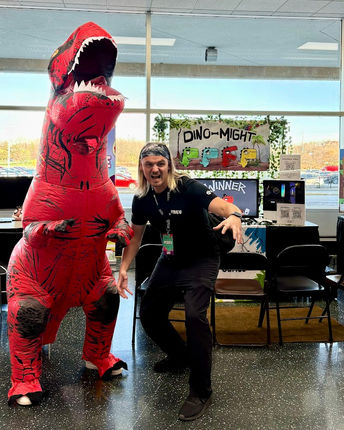
In April 2024, we showcased Dino-Might at the Midwest Gaming Classic, a consumer convention. In November, we showcased at M+Dev, a game dev conference, with new features. I view conferences as invaluable opportunities for playtesting and expanding our network!
Production
In addition to UI/UX and Level Design, I also handle production management, manage social media, conduct playtesting, and present data to the team.
Production Responsibilities:
-
Scrum and Agile Methodology: Sprint Planning, Retrospectives, Kanban, etc.
-
Manage Trello + task tracking
-
Project Roadmap
-
Conferences + Budgets
-
Leading team meetings
-
Scheduling internal and external meetings
-
Documentation
-
Organizing and presenting data
-
TEAM COMMUNICATION
-
And anything else that requires any production!
Social Media Responsibilities:
-
Plan content using a spreadsheet
-
Film, edit, and post content regularly
-
Community engagement
-
Research marketing costs

UI/UX Design
First Problem
We require both a tutorial and a player selection menu that is streamlined, clear, and intuitive. Given the simplicity of the mechanic and genre, I believe an in-game tutorial is not essential.
Playtesting revealed that most players were confused about how to play. Additionally, we introduced power-ups and new buttons that require clear explanations.
Solution
I designed a streamlined menu with a central visual tutorial, enabling players to quickly focus on the most important information.
Based on feedback, I developed a version 2. I reassessed the information hierarchy, incorporating power-ups and a clearer controls visual. Then I integrated in-game sprites for added clarity and worked closely with the artist to finalize version 2.
Recent playtesting has shown that version 2 still lacks clarity. I am currently working on developing a more refined, visually engaging menu with animations.
Second Problem
We added customizations and needed an intuitive menu. However, there was disagreement on the layout—while the artist and team preferred a vertical design, I disagreed for UI/UX reasons.
Solution
I conducted user research on the flow and shared the findings with the team. With this data, we decided to move forward with the research-backed approach, collaborating closely with the artist through an iterative process to refine the current menu design.

Not mine - Artist's Sketch

Not mine - Artist's Sketch

The artist and I worked closely to refine the visuals. Not mine - Artist's Artboard

Not mine - Artist's Sketch
Level Design
Problem
We needed to design dynamic levels with enough player maneuverability for a balanced and engaging experience. However, during early playtesting, we found that fixed spawn points gave certain players an unfair advantage, impacting gameplay balance.
Solution
I designed the levels to incorporate varying platform heights and made sure players could move freely across both sides of the screen, allowing for a wider range of movement and playstyles. To address the spawn point issue, we implemented random spawn locations for all players, ensuring a more fair and unpredictable gameplay experience. These changes helped improve the overall balance and user experience in the game.
Gameplay
Credits

Developer/Programmer................................Kevin King
UI/UX/Level Design, Project Manager...........Katrina Senebouttarath
Character Artist and Animator......................Taylor Deckert
Enviormental Artist.......................................Arinmir Sabin
Programmer..................................................Delano Kraig


